
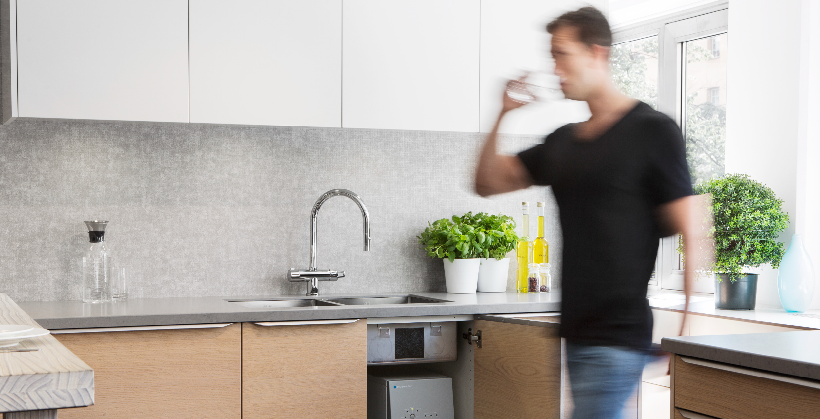
Specialising in HVAC products for nearly three decades, Nia – an established distribution house in the UAE – expanded its offering in recent times to include home and well-being products. The company also restructured its business by venturing beyond distribution and setting up physical and digital channels for DTC sales. This strategic shift in Nia’s business direction and associated ambition of becoming a recognised and trusted lifestyle brand required overhauling the existing brand positioning and visual identity.
Strategic
Early into the brand audit a key differentiator became apparent –
a ‘family enterprise’ ethos steers Nia. Set in place by the founder,
the ideals of ‘care’, ‘consistency’ and ‘commitment’ guided
employees in their every interaction with each other, customers,
suppliers, and partners.
Brand workshop and interviews reaffirmed these ideals and
business ethos, leading us to a key insight: Nia is committed to
enhancing living. Be it their carefully curated portfolio of high-
quality brands, their customer relationships and sales services,
their efforts towards becoming a sustainable business, Nia’s
every action is guided by the principle of serving people and the
wider community.
Building on these findings we developed Nia’s strategic platform that highlights Nia’s continuous endeavour in ‘Making Life Better Every Day’. Nia understands that quality of life is never to be overlooked, which is why with its selection of high-quality living and well-being products and its innovative HVAC solutions Nia is focussed on enriching lives every day.
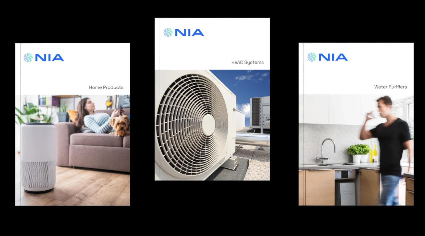
Accompanying the brand strategy, we created a robust brand architecture that articulates Nia’s different business verticals. Most importantly, the brand architecture serves as a tool to manage growth as and when new brands and products are added to the Nia portfolio.
Creative Solution
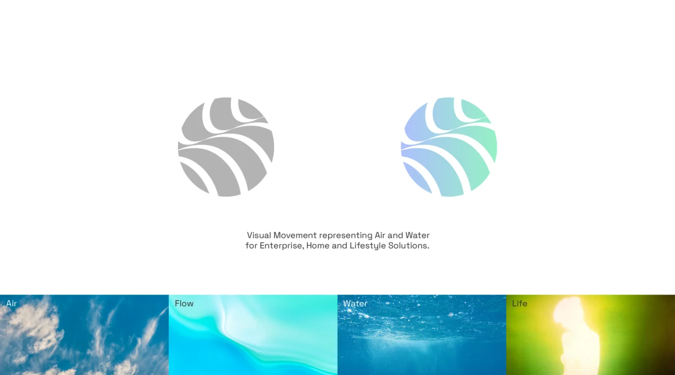
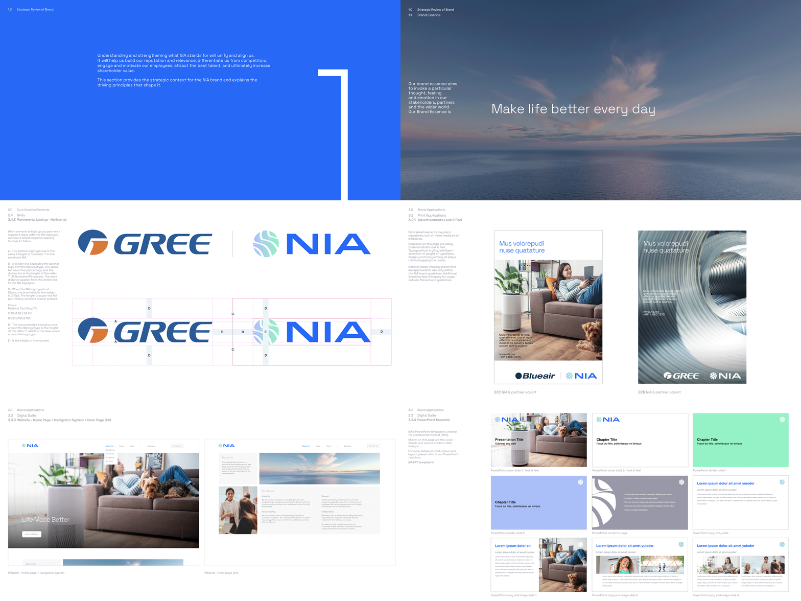
For Nia’s new visual identity, we wanted to create a logotype that symbolises Life; particularly, symbolising air and water as in addition to these two elements being vital to life, they also poetically give a nod to Nia’s foundational product line of HVAC.
The resulting logotype illustrates life, flow, and vitality. Put simply, it conveys Nia’s promise of a fulfilling, enriched and comfortable living that’s made possible through its exceptional products. Made up of a crafted roundel brandmark and a unique wordmark, Nia’s logotype reinforces the brand’s commitment to the HVAC, living and well-being space.
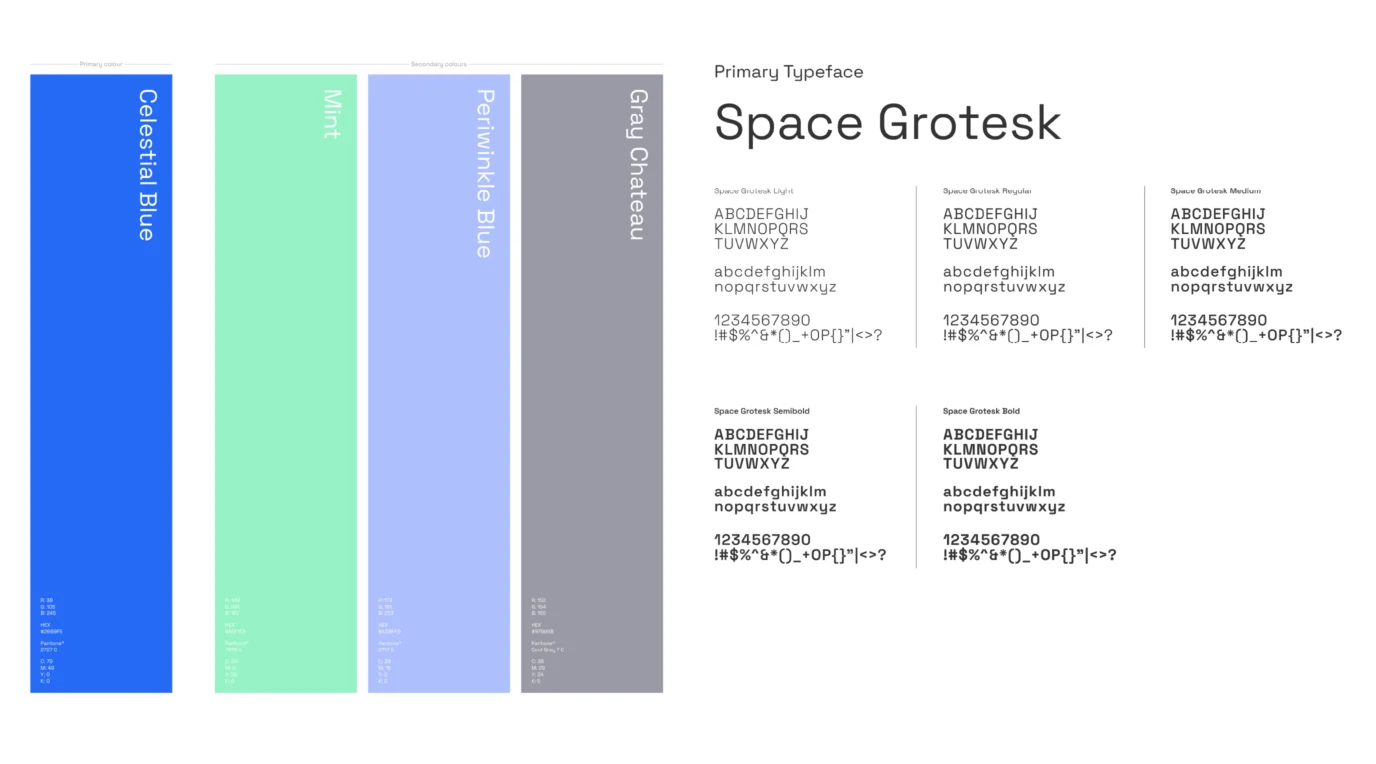
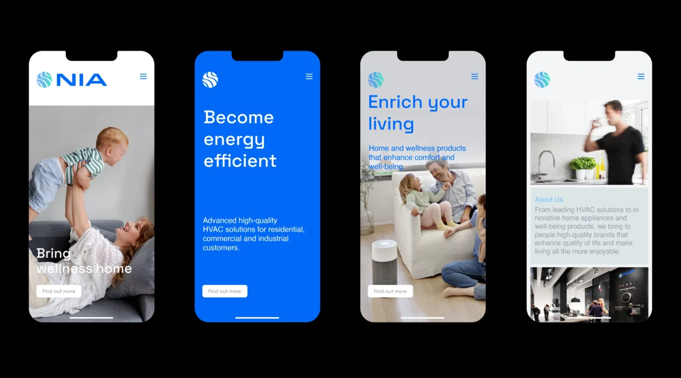
Supporting the logotype are upbeat yet tranquil brand colours that reiterate a feeling of life, living, well-being and comfort, whilst also conveying trust and dependability in Nia.
With its modern, human, and simple approach Nia’s logotype reassures in a firm yet friendly way. It is strong, empowering, and legible and in time will act as a mnemonic devise that signifies Nia’s spirit and energy.
Growth since rebrand
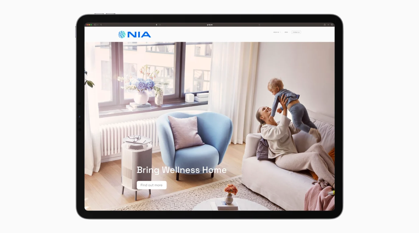
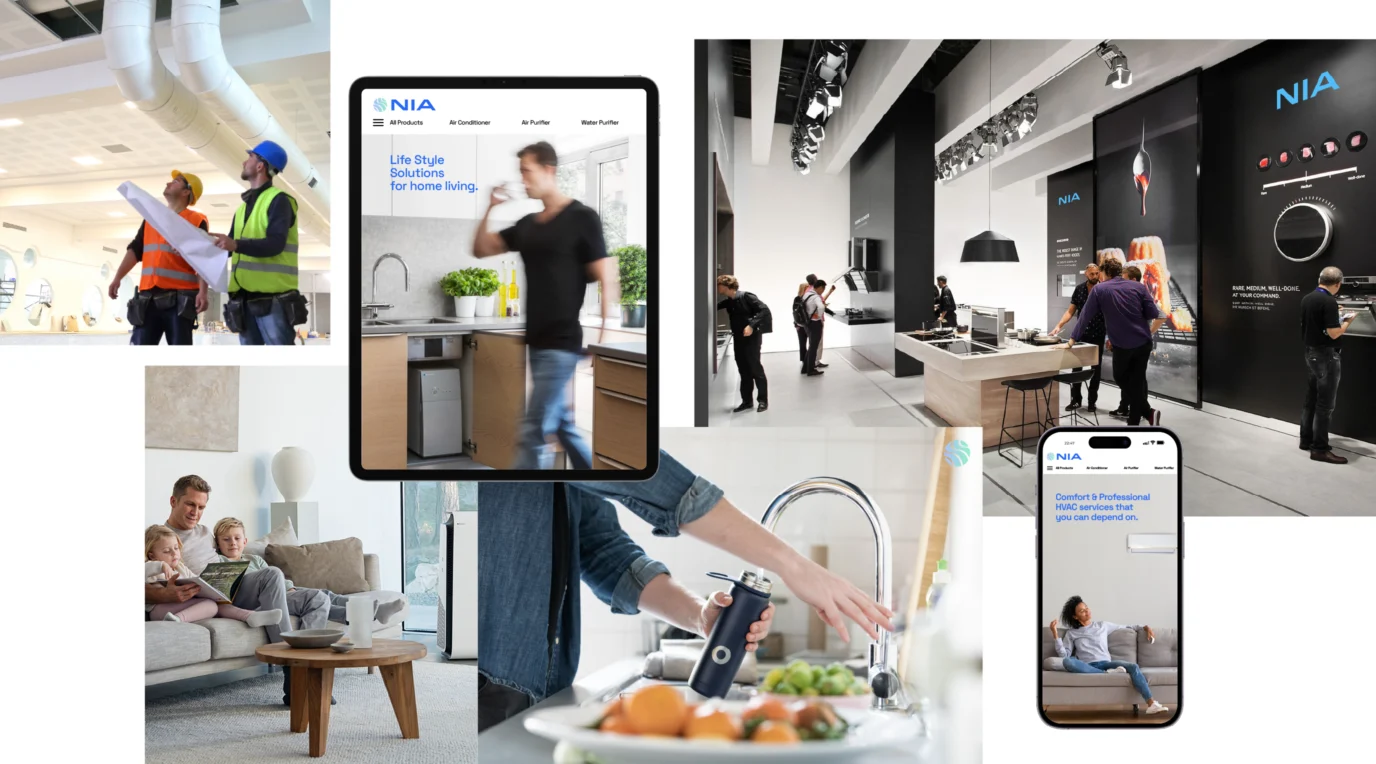
Since the rebrand, Nia has grown into the wellness-led lifestyle brand the strategy set out to build, now trading under the promise “Bring Wellness Home.”
Its HVAC heritage remains the technical backbone of the business: Nia has delivered chillers and VRF systems to more than 1,000 landmark projects across the region, including airports, power plants, hospitals, universities and multiplexes, with over two million units installed and supported by a service network of 350 providers.
The lifestyle and wellbeing side of the business has expanded alongside it.
reinforcing the “enhancing living” positioning the brand strategy was built around.
Project Summary
- Brand Strategy
- Brand Audit
- Brand Workshop
- Brand Interviews
- Brand Strategy
- Brand Positioning
- Brand Expression
- Brand Identity
- Visual Tone of Voice
- Brand Experience
- Brand Communications Suite
- Brand Management
- Brand Guidelines