For over two decades Abu Dhabi Ship Building (ADSB) has been the partner of choice for the UAE Navy, playing a major role in increasing the nation’s naval defence capabilities. Gradually over the last years, ADSB shifted its business strategy from solely building naval ships to expanding into areas such as oil & gas, marine support services and commercial shipbuilding. An UAE success story, ADSB turned over a remarkable USD 252.6 million in 2016, continuing to set new standards in the maritime industry on a national and international level. As such, ADSB commissioned James to build a new brand that would reflect just that.


Strategic
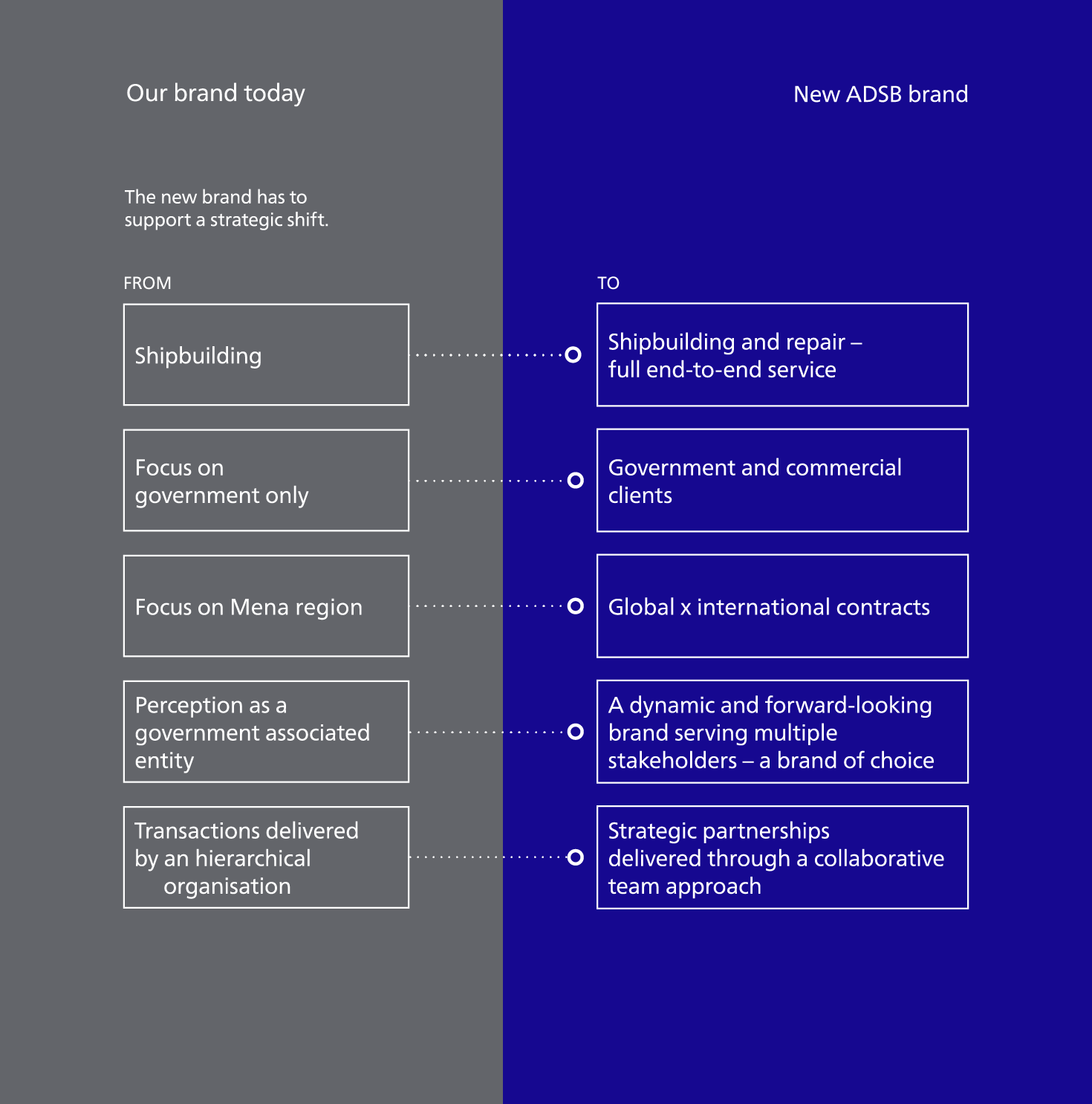
The main challenge was to redefine the ADSB brand to represent their vast capabilities and stature in order to increase their competitiveness. The new brand needed to make an impact on all stakeholders, showing how ADSB is evolving with the times and embracing change.
After several workshop sessions and interviews we were able to define and articulated the brand strategy platform and what the ADSB business stood for; ‘Driving Maritime Excellence Together’. The strategy platform we developed for the brand also entails and defines ADSB’s brand values and brand personality. Our role was to develop a strong, unique brand that would stand out from its competitors. The maritime industry can be defined as a homogeneous landscape; generally overflooded with brand identities showing anchors and boats. This was something we consciously moved away from as it did not align with our brand strategy platform.
The initial client direction was to change the company name as their competencies goes further than building ships. After extensive research we concluded that the name Abu Dhabi Ship Building carries such a proud history, our recommendation was thus to keep the name, but rather use and solidify the abbreviation ADSB. From this decision the tagline ‘Beyond Shipbuilding’ derived. The tagline encapsulates ADSB’s promise of long-term commitment, from shipbuilding and delivery to maintenance, repair and overhaul services.
Creative Solution
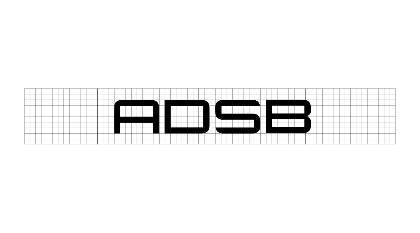
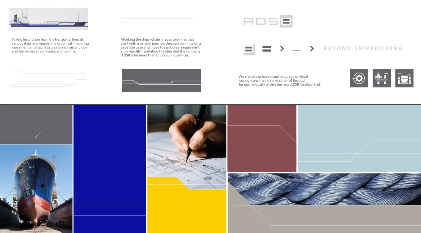
Based on the brand strategy we explored options of what would represent the acronym of ADSB and how that could be executed to a wider service offering than just shipbuilding. Looking at what could be more than > symbolising the business we created a strong visual wordmark representing maritime services.
The identity is a simple yet responsive intelligent identity system. The lettering in our logotype has been specifically created to represent the human interaction of the skilled engineering and craftsmanship in the shipyard. We developed a flexible identity system that caters for every need. The deep blue colour used in the identity represents ocean maritime and attributes to confidence, reliability and trust, while the grey represents maturity, steel and security. The identity is rooted in credibility. The blue container — the beyond box — acts as a visual transmitter with the power to influence messaging from the letter “B” for “Beyond” to the imagery and service icons that we developed.
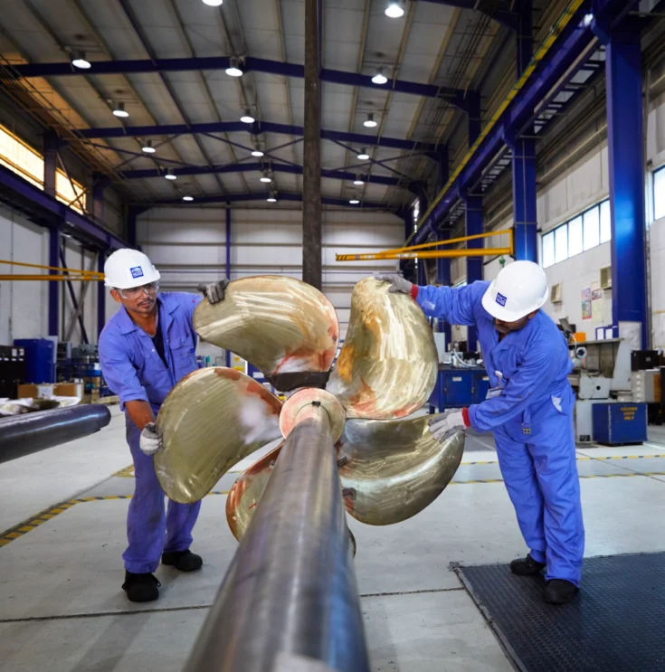
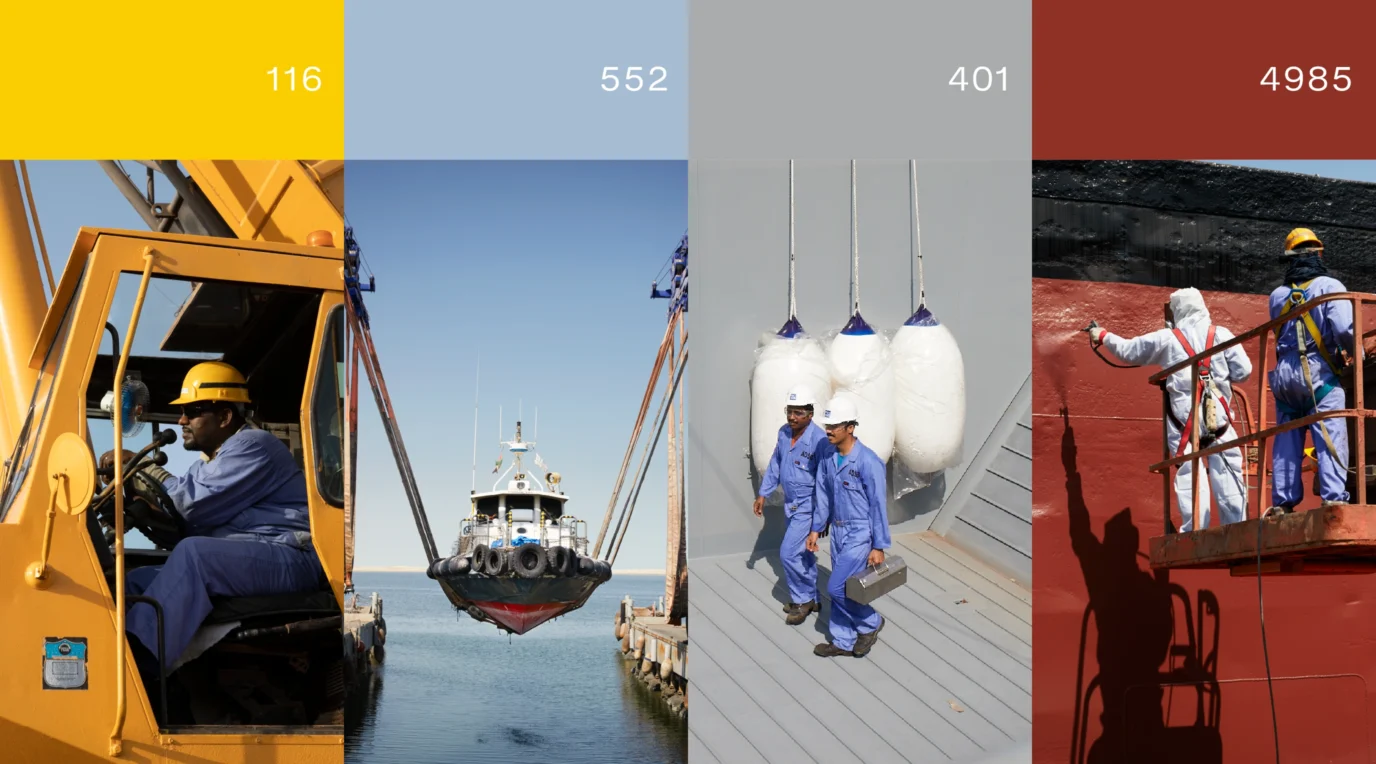
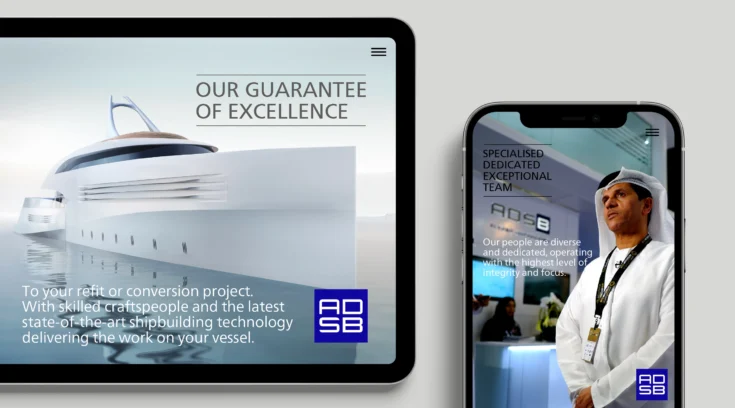
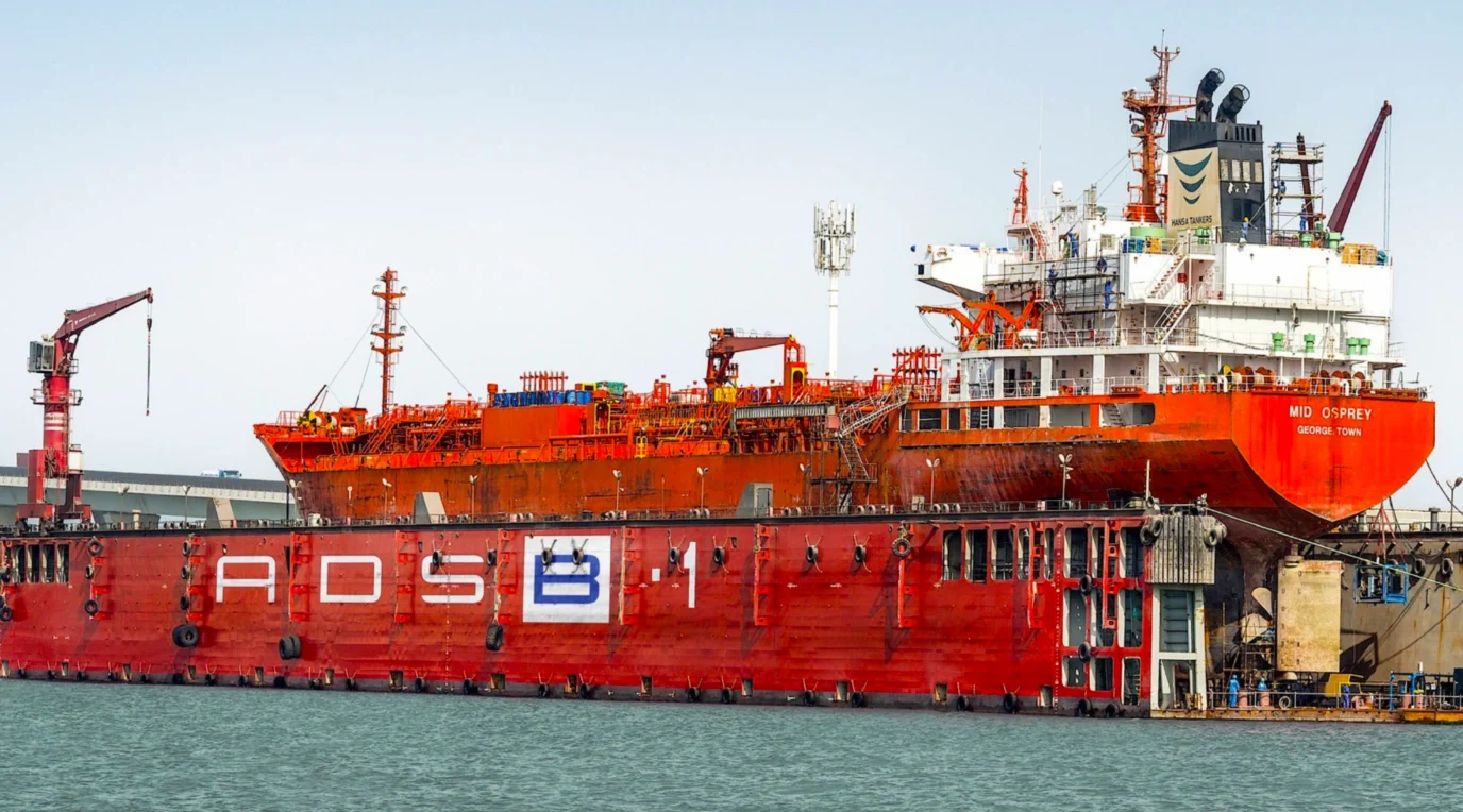
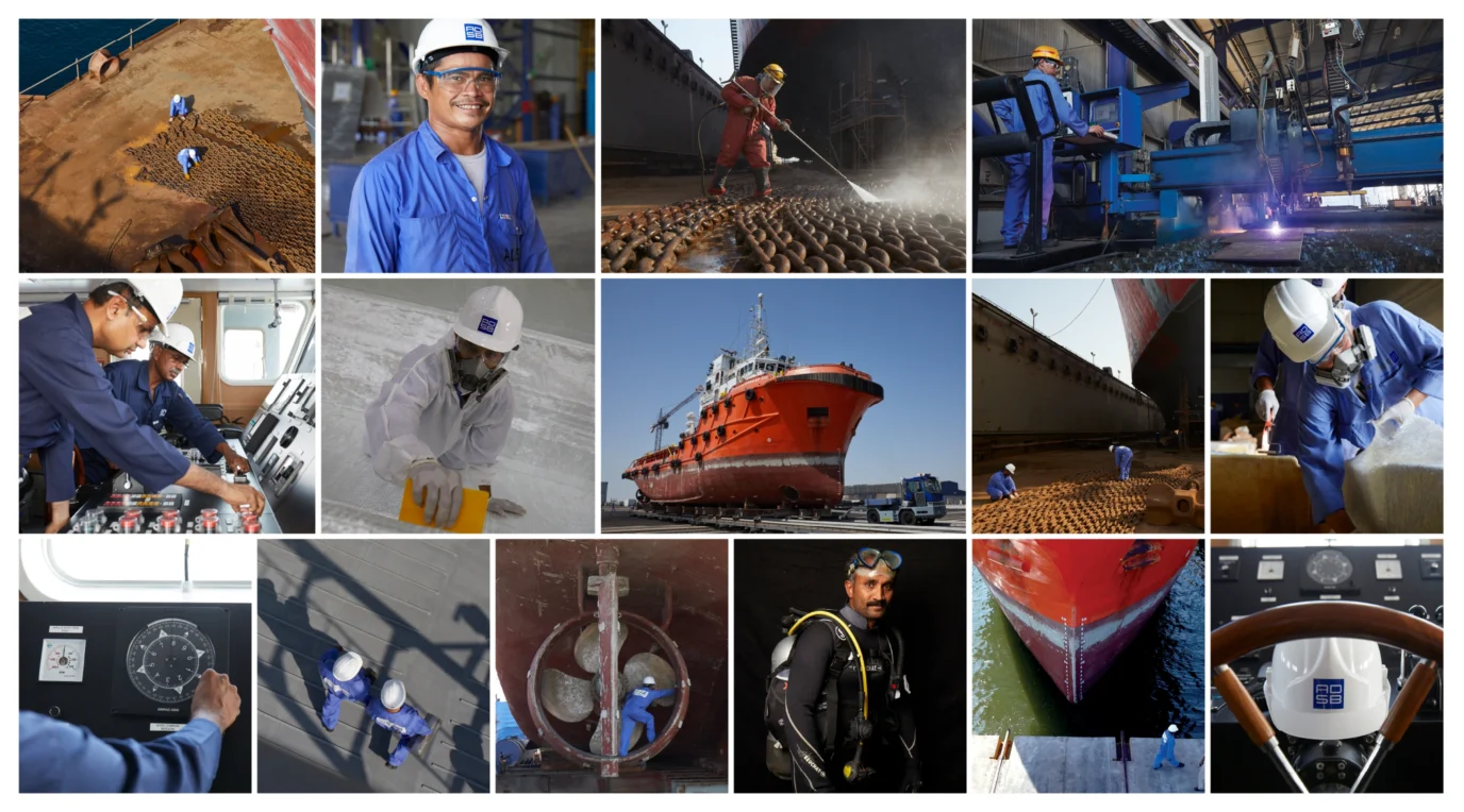
To capture the colourful spirit of ADSB, its shipyard, services and excelling employees, we conducted a 3-day photoshoot followed by a 3-day videoshoot resulting in an impressive image library and a captivating corporate video. We also developed ADSB’s new website giving the company an on-brand, responsive and easy to navigate digital platform for all of its current and future stakeholders.

Project Summary
- Brand Strategy
- Brand Audit
- Brand Workshops
- Brand Strategy
- Brand Positioning
- Brand Naming
- Brand Expression
- Brand Identity
- Copywriting
- Visual Tone of Voice
- Brand Photoshoot & Image Library
- Brand Experience
- Brand Communications Suite
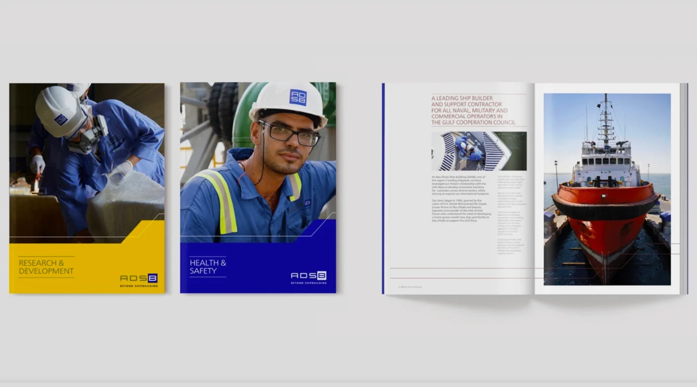
- Print Applications Design
- Website Design & Development
- Corporate Videos
- Corporate Brochure
- Brand Animations
- Brand Management
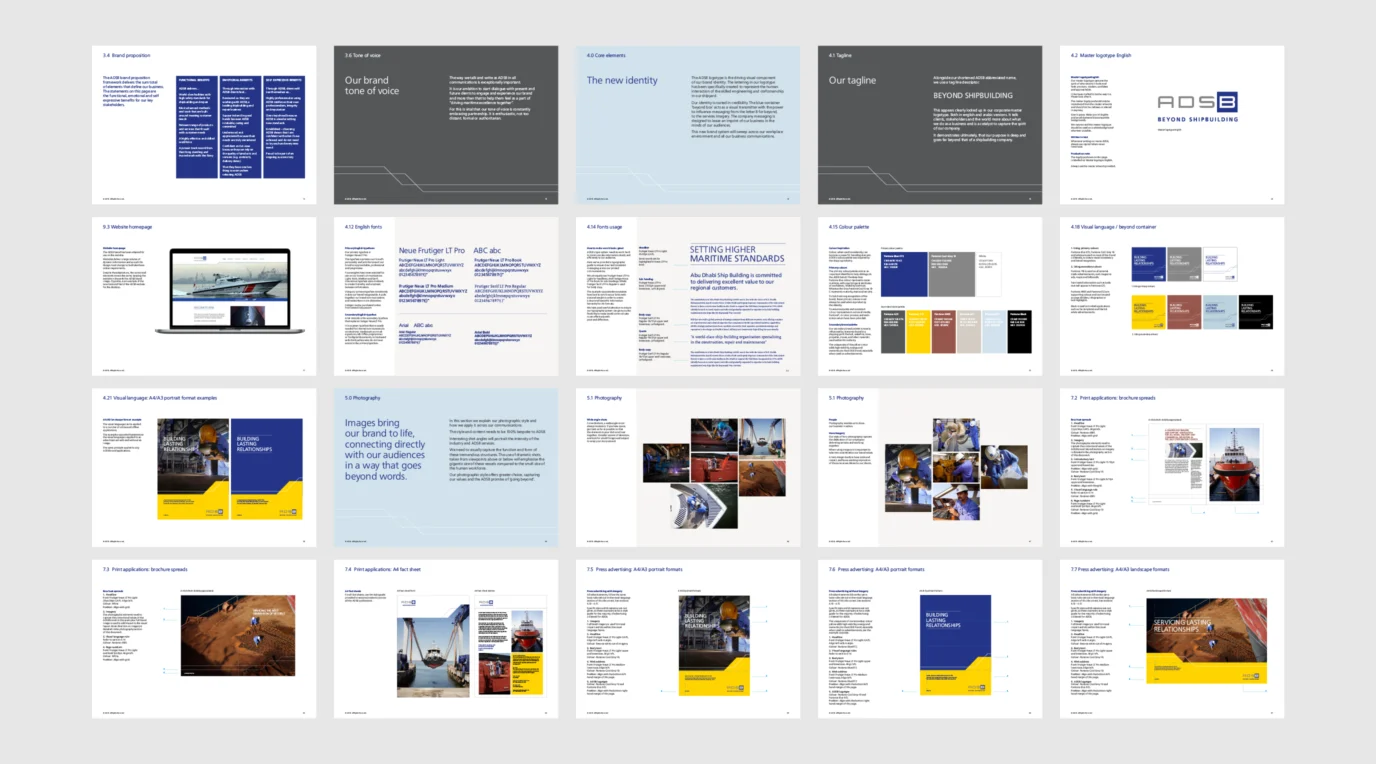
- Brand Guidelines
- Brand Launch


