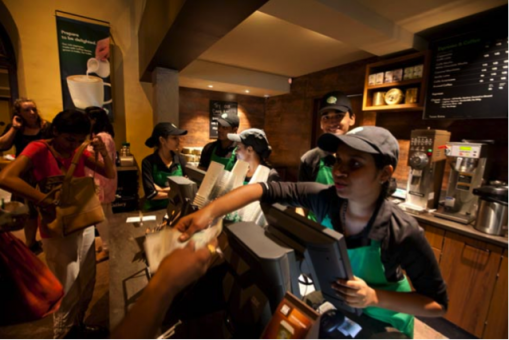
Whenever we think about a brand—we automatically think of a logo. Visions of the different brands in our lives will flash before our eyes: the cursive red Coca Cola logo, the green Starbucks mermaid, Apple Inc.’s white apple with a bite in it, the patterned “LV” splashed across a Louis Vuitton bag.
But there’s a bigger picture…literally.
As consumers, much of our buying behaviour and our purchasing process is influenced by the environment in which we make those decisions…the brand environment.
So what IS a brand environment?
In the most technical terms, a brand environment is the brand identity of an organization applied to a three-dimensional space, usually in a retail storefront.
The brand environment applies to everything from the furniture in a store, the lighting, the level and type of music playing, the scent of the environment, the layout of the customer journey throughout the story, down to the appearance of the salespeople and the service received.
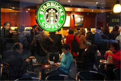
Think back to the same brands mentioned earlier. When we enter a Starbucks, we know exactly where we are, how we can expect the place to look, how we can expect to feel, and what kind of service we can expect to get, before you see a Starbucks logo anywhere.
The place FEELS like the brand we have been trained to love. Rich brown black and green colors, plush furniture, round wooden tables, and soft, eclectic instrumental music playing in the background. You immediately feel at home, settling into your couch with a hot cup of coffee and a WiFi password. You stay for hours, inevitably compounding your purchases as the hours tick by. When you think of Starbucks, you don’t just think of coffee, you think “warm and fuzzy”. Every detail in a Starbucks retail outlet is carefully considered, down to the round tables, designed to facilitate “closeness” and conversation.
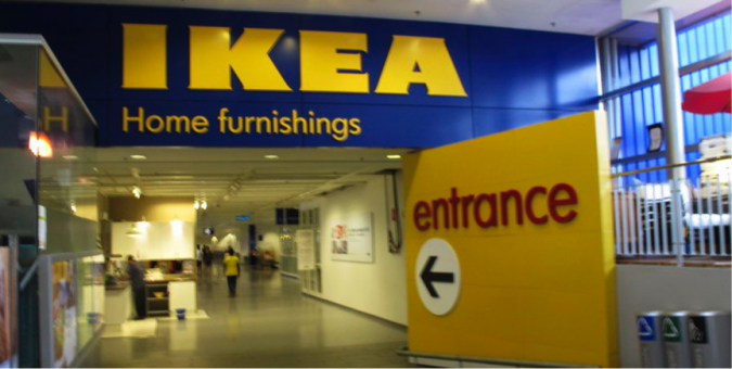
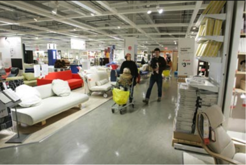
IKEA is another great example. The brand’s bright blue and yellow colors have become synonymous not only with low-cost modern furniture, but also with a “fun-for-the-whole-family” experience, with retail stores having everything from a ball pit for children and a food court for customers.
The customer journey itself is unique, as customers in IKEA are subtly “forced” to walk through the entire showroom by following a yellow line painted on the floor, thus exposing them to the whole range of products and possibilities available in the IKEA portfolio. It’s not uncommon to “go in for one thing, and come out with 10 other things”. When you think of IKEA, you associate the brand with a fun outing to do something that is otherwise very tedious and boring (furniture shopping can only be made so exciting!)
What about the Louis Vuitton retail store? As soon as you enter, you see dim, romantic lighting, plush carpets, velvet curtains. The entire experience speaks of luxury, status, class, and premium quality products, down to the perfectly polished glass showcases and the sharply dressed salespeople in crisp suits and white gloves.
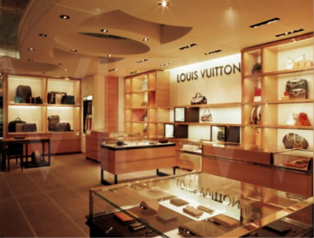
Think now about the Apple store, designed in essence, like a tech lab.
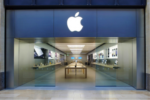
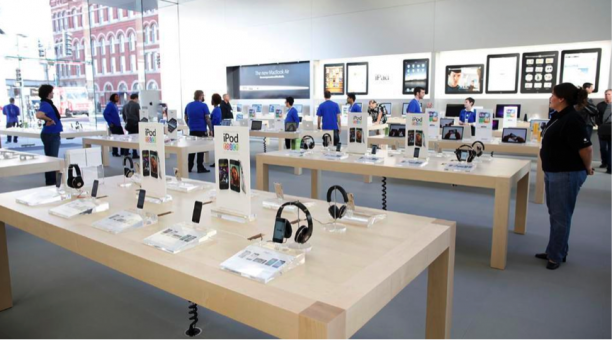
People mill around the store “for fun”—during their lunch breaks, on the weekends, randomly as they’re walking by. Clean white lines, upbeat music, and lovably tech-passionate staff always on hand to help you play with that product you might not even purchase (but most probably will) all add to the Apple store experience.
How many products do you buy as a direct result of the environment you found them in? How many places or products do you go back to simply because it’s “always fun” to go and window-shop? Half the battle of businesses is getting customer footfall and driving traffic into their retail locations—the other half is converting those visitors into customers, a big part of which can be done through investment in a brand environment that inspires loyalty, affection, and affinity to the brand.
