Colour and its relationship with an audience is deeply subjective. At its best, it profoundly influences how we feel and what we perceive. When applied to a brand, colour becomes elemental, capable of unifying visual language, evoking emotion, and instantly distilling the brand’s essence.
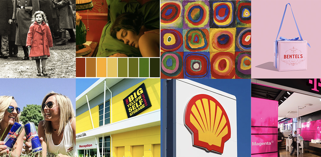
In much the same way, colour goes beyond aesthetics: it becomes a form of storytelling. Without colour, the iconic image of the girl in the red coat in Schindler’s List, the distinctive palette of Amélie, and the dramatic shift from black and white Kansas to the vibrant world of Oz all lose their impact. Colour elevates narrative, connects memory to meaning, and transforms the ordinary into the extraordinary.
Brands are always looking for ways to connect and say something meaningful.
Often, words carry that message, but colour, when selected with deliberation, can convey what language cannot. It expresses tone, pace, and personality with extraordinary efficiency. When thoughtfully applied, colour becomes the unifying thread, linking the visual identity, supporting the brand story, and bringing all brand elements into a coherent and elegant whole.
As stated by Wassily Kandinsky, the father of abstract art, “Colour is a power which directly influences the soul,” highlighting the powerful and transformative effect colour can have on our inner world.
In this post we explore key factors to consider when selecting your brand’s colours.
1. Select with intent
Selecting a colour simply because “it looks good” is a missed strategic design opportunity. A brand’s colour should never be arbitrary; it must align with the brand’s purpose, values, and character.
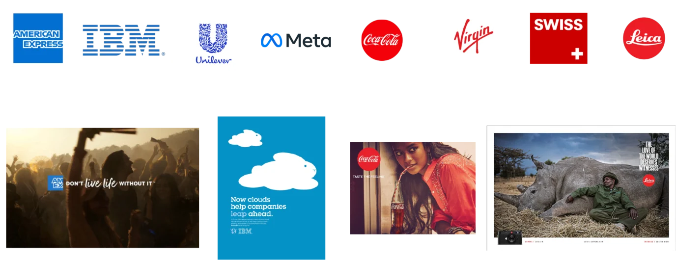
Take blue, for example: long associated with trust and dependability, it’s no coincidence that brands like American Express, Unilever, Samsung, O2, and Meta have leaned into its depth.
If energy and excitement are at the heart of a brand, bold reds are a compelling choice. Red stimulates the nervous system and increases adrenaline levels, making it a colour closely tied to action, passion, and momentum. Brands like Coca-Cola, Leica, and Virgin have understood this and embraced it with intent.
On the flip side, imagine Coca-Cola in a blue or American Express in a red. The experience would falter, and the emotional connection would be disrupted. This is the emotional resonance of colour: to build or break a brand.
2. Aim for colour distinction over exclusivity
The idea of “owning a colour” as a brand asset is alluring, but it’s completely misguided.
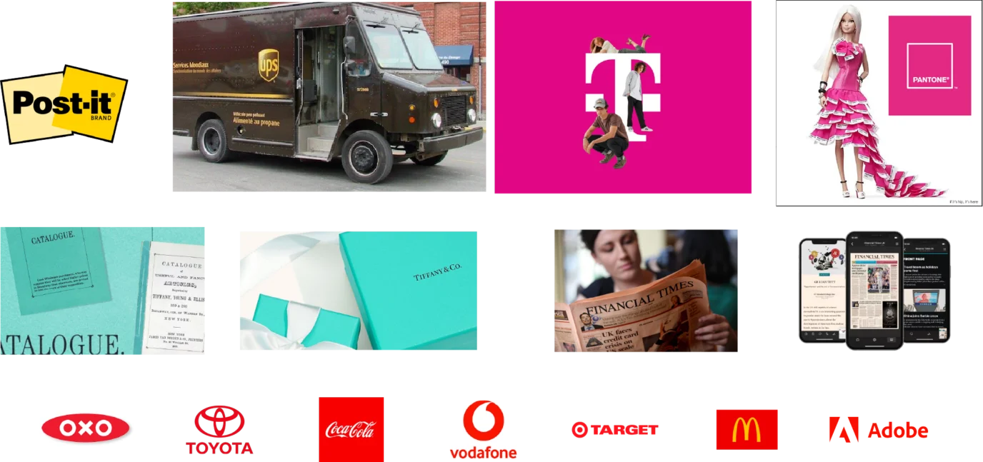
While a brand colour can be trademarked within specific industry sectors, such as Post-it yellow, UPS brown, Barbie pink, or Deutsche Telekom magenta, no colour can ever be truly monopolised. After all, there are only around 2,390 solid Pantone colours available globally. That’s why prominent brands like Coca-Cola, Toyota, Adobe, and McDonald’s all use the same red (Pantone 486), each making it their own in their distinct industries.
What’s more important than colour exclusivity is colour distinction, building an association with a colour that holds meaning and relevance within a specific category, and more importantly, reflects your brand attributes.
The Financial Times has been renowned for its salmon pink since 1893. Tiffany & Co.’s signature Tiffany Blue dates to the cover of its 1845 catalogue. Both brands have built their colour associations over generations through strict brand management. It’s not a shortcut to identity; it’s a triumph of consistency.
3. Refine when familiarity exists
Sometimes a colour that aligns perfectly with your brand already exists in your category. Don’t consider this a problem, but instead an opportunity for refinement, variation, and subtlety.
Consider Barclays, Bank of Scotland, Deutsche Bank, Emirates NBD, and FAB. Each brand, in the same sector, features blue yet each expresses itself distinctly and holds its own space in the market. This is because their colour systems are not differentiated by hue alone, but by the distinct stories they tell and how they behave across platforms.
Beyond colour hue, a brand’s identity is founded on its execution, typography, motion, material, and sound. So, if a colour aligns with your brand strategy but already exists in your sector, it’s still worth pursuing. Simply shift the shade, adjust the tone, and refine the application. Consistency across the brand ecosystem will create clarity over time.
When considering a colour, just ask: “Does this colour elevate our brand’s story?” If yes, proceed, and if needed, refine.

4. Consider colour as a Living Asset
A brand’s colour is not meant to be static; it’s strategic. Evolving / adding to a brand’s colour palette is not a departure from the principles of branding; it’s a proof of them. Colour is a tool, and its effectiveness lies in how well it aligns with a brand’s purpose, audience and context.
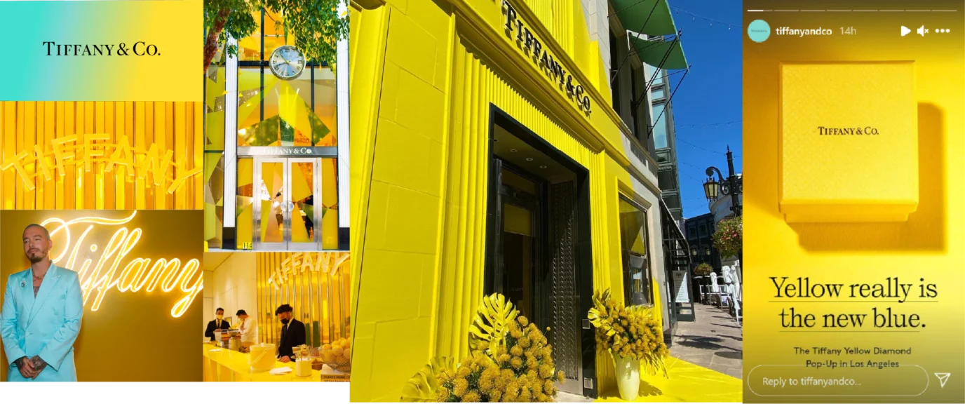
At some point, all brands must evolve, even the most iconic ones. For example: Tiffany & Co, now a part of LVMH, in a modern campaign introduced a striking yellow variant that was deliberate, provocative, and compelling. This move was not to abandon the brand’s past but to reframe its future: to challenge expectations; to signal change; and to expand on legacy. Tiffany & Co’s new colour invited a new audience into the brand story.
As we conclude, keep in mind:
- The strongest brands use colour with purpose.
- There is no precise formula for selecting the right colour, but the best decisions are grounded in strategy, not instinct.
- True colour distinction comes from a series of decisions made with care, context, and conviction.
- Apply brands colours consistently and let them evolve with clear intent.
