In a day and age where people are always competing to look newer, younger, fresher, brands are no exception. 2014 was a year of big facelifts, and not just on our favourite celebrities—some of these makeovers were on our favourite brands!
These corporate nip/tucks, or “rebrands” are often followed through for a multitude of reasons, but they usually occur when a business decides to change a significant element of the brand. Such a change could be glaringly obvious like a new brand name or logo, or it might be a more subtle alteration, such as a slight shift in messaging to better communicate a more relevant brand promise.
Whether a corporate rebrand is due to predicted growth, a new line of business or market, a new audience, or just an effort to establish relevance, the task is a daunting one, especially when you hold your breath to hear how consumers who know your brand pass final judgment (Outrage? Applause? Appreciation? Confusion?)
Here we round up five of our picks for the biggest rebranding stories of 2014…and we’ll let you pass your own verdicts:
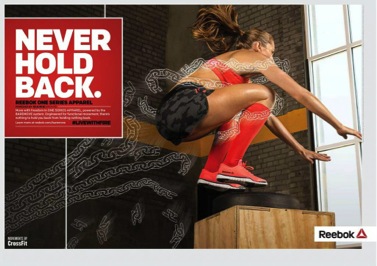
1) Reebok
The company faces huge competition from the likes of Under Armor, Nike, Puma, and Adidas, and knew that the new brand should not try to compete with these giants, rather, they should differentiate themselves to prove their product quality, value, and performance.

2) Olive Garden
An American “fine fast food” dining staple serving family style Italian food, The Olive Garden revamped their brand to much criticism—not only over the drastically different new design, but the fact that top management expected the new brand to usher in a “renaissance” for the brand, when all their changes were only superficial, without any real internal organizational, product quality, or employee engagement changes. Customers didn’t really care about the logo so much if their food was still bland, overpriced, and servers were just as unenthusiastic as ever. The lesson here? A pretty face with no substance won’t get you very far!

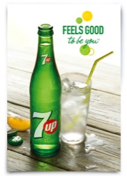
3) 7 Up
For a brand that promises drinks that are “crisp, fresh, and bubbly”, 7 Up put forth a new brand in 2014 that was exactly that. A global icon, the company couldn’t shy too far away from its original style, but added a bit of modernity to keep up with the times (and to keep customers happy).


4) Netflix
The entertainment industry was not to be left out in the roster of this year’s rebrands, with online streaming media provider Netflix throwing its hat in the ring. Originally a home DVD/CD delivery service, Netflix went where the market went, and shifted its focus to an internet based online media streaming service provider. Netflix’s new brand moved seamlessly into the hearts and homes of customers very much as Netflix’s new business strategy seamlessly repositioned the company and moved huge profits into the company’s bank accounts. While the design change may appear minimal, the strategic shift proved hugely profitable.

5) Marriott Hotels
Hotels and hospitality remain one of the most cutthroat business sectors, with customers constantly demanding, more, better, newer, faster, cheaper, and competitors seemingly always cropping up promising just that. The Marriott brand however, is a household name, equated with quality, service, and comfort—but how were they to compete in a new age of fancy, flashy, glitzy hotels that were “modern” or “boutique” or “artsy” and “fashionable”? The answer was to not deviate from the brand’s core strengths, but to give it a bit of a makeover, allowing it to stand out from the fancy new brands and maintain its position as a industry standard.

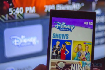
6) The Disney Channel
With a name like Disney, it’s guaranteed anything the brand puts its mark on will sell—but what happens when that brand is out-dated? Disney’s challenge has been to stay (and stay looking) fresh and relevant for a young audience that is completely attuned to trends, pop culture, style, fashion, and design at younger and younger ages. The name itself isn’t enough to sell products anymore, Disney has to look as “cool” as its target audience.


5) Black & Decker
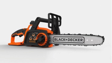
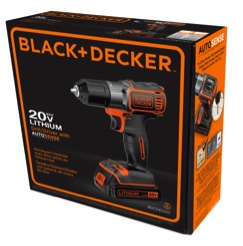
For many years Black & Decker has been a household name synonymous with quality appliances and machinery. Both the name and the brandmark have very strong recognition and affinity, so any design change could not deviate too far off course from the original logo. Black & Decker unveiled in 2014 a new logo that added a bit of an edge to its brand and its product, starting up the “do-it-yourself” renaissance and making home projects and working with your hands cool again.

2014 has definitely been a year for brand rebirths—and while we can’t dissect them all here, we’ll leave you with a few more to weigh in on.
Hershey’s 
Visa 
K-Swiss 
Equinox Gyms 
Southwest Airlines 
About.com 
MSN 
Which ones do YOU think sank, and which ones do you think swam strong?
