
Colours are a language of their own; in every day life and in visual communication, they are one of the first things we register when we are assessing anything. They evoke emotions and have psychological properties that instantly trigger various thoughts, memories and associations for people, environments and events.
Art, design and music have always been an a representation of how a culture expresses attitudes and emotions of the time: this expression is represented in forms of design. For example, the 70s recession brought earthy colors, environmental movement into the design. In the 80’s, we see an explosion of vibrant colours with the economic upturn and MTV’s influence on spreading pop music. In the 90’s, we see grunge and graffiti style. The 00’s, we see the influence of the technology revolution and minimalism, individualism and globalisation.
Colour is one of the first associations that consumers make with a brand identity; it increases brand recognition by 80 percent

Brands and colours are inextricably linked because they offer an instantaneous method for conveying meaning and message without words. Whilst creating their own identities, brands have always expressed themselves, their values and personalities. Colour is one of the first things that a consumer notices about a brand’s identity, it can increase brand recognition by up to 80 percent.
In marketing, colours can influence a buying decision; they can cause us to reject products and experiences before we even know what the product has to offer. Carefully selected colours can draw us in, evoke openness and create a mood conducive to new messages and buying hence colour becomes a very important aspect in visual communication and branding.
JAL (Japan Air Lines) branding is a good example of color usage with story telling and cultural representation. The bird symbolizes flight and the color red communicates happiness and good luck in Asia. The circle and the color red are a reference to the Japanese flag. Therefore, the brand image communicates powerful air transportation from a Japanese company and good luck during the journey. The brand has a quick association with the destination of origin and a positive message.

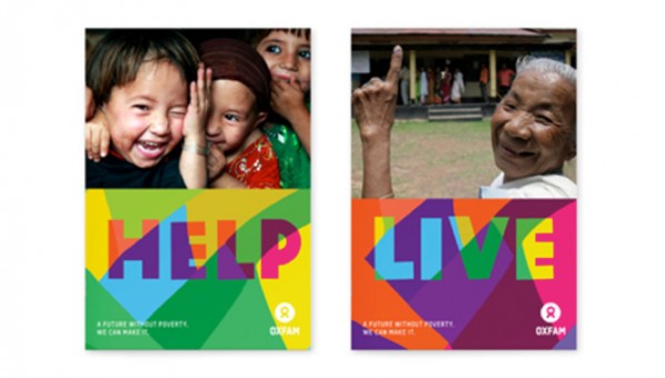
The rebranding of Oxfam is another example of great solution of using a positive and bright colour palette to communicate optimism. The NGO has to deal with famine and world disasters and yet requires support from around the world. The usage of brand colours was a successful decision to help capture and reinforce Oxfam’s positive attitude towards its goal and fundraising.
Effective brand strategies and solutions must consider the influence and importance of colour in branding and visual communication. It is far more than an aesthetic consideration; it is a combination of considerations that make up the brand idea, its experience, perception and influence.
