Brands are living things; they live, age and (sometimes) die, but with nurture they last, and usually for long. Every brand has a set of values that connects to its geography and culture, keeping it on brand and delivering it’s promise; educational brands are no different.
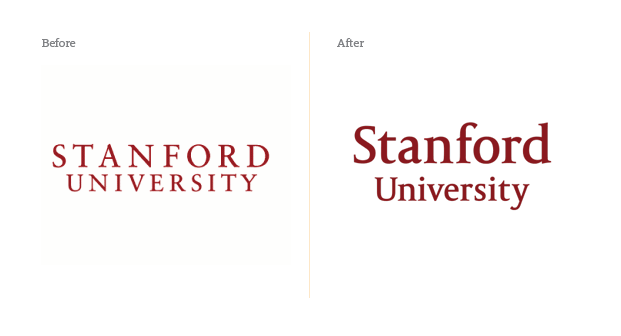
In 2012, Stanford University, the cradle of Google, Facebook and Yahoo! founders, decided to change its logos. Stanford traces its origin to 125 years ago and thus the university revamping its logo came as surprise – after all these years, why would a prestigious, globally renowned university with a long heritage of success undertake such a step? To answer this, let’s step back and look at Kodak.
Kodak, the legendary imaging company, was one of the first companies to invent the camera set and introduce photography solution to the public. It had thousands of patents within the technology industry and almost every memory taken before the 2000s was printed on Kodak paper. Last year, however, the company filed for bankruptcy, stating that it couldn’t compete in the market anymore; digital cameras had replaced traditional cameras and cellphones and memory cards had eaten into the film rolls market. In glance, if we look at Kodak’s history, we see that the company only focused on what it did best – making film rolls, a physical product. The company had left all its digital sector stranded up until the late wake up call in 2010 when it realised it was unable to compete with digital camera manufacturers. The market was flooded with all types of imaging gadgets, far more than what Kodak offered. Customers were not buying cameras anymore, they were buying phones with cameras and flash disks instead of film rolls. While the world was going digital, Kodak was still physical. Every market observer realised then that Kodak had failed as it lacked the agility and dynamism to adapt with the market need and failed to fill in the gap.
Stanford University, on the other hand, is far more visionary. The VP for communication once said, “The other mark is very pretty and academic and classic, but it was designed specifically for print and stationery, the world has changed in the last 10 years”. For a university that sits in the heart of Silicon Valley, it had to adapt and slightly change its identity, especially for digital applications. The brand had to go for a more simplified version where it could be more approachable and didn’t cause any technical glitches.

Stanford University knew that being dynamic is a part of the process and progression and unless a brand is agile and flexible it faces the risk of breaking, which is what all brands should understand.